
On Tuesday, U.S. Census Bureau released their annual report on income, earnings, income inequality, and poverty in the United States, and, as usual, it paints a very grim picture for our nation’s children. Specifically, it is a grim picture because, once again, children represent the age group with the highest rate of poverty in the wealthiest nation in the world.
But, if you were looking for good news, just take a look at the chart below — or even just the right side of that chart — and you’ll see all you need to know about child poverty in America.
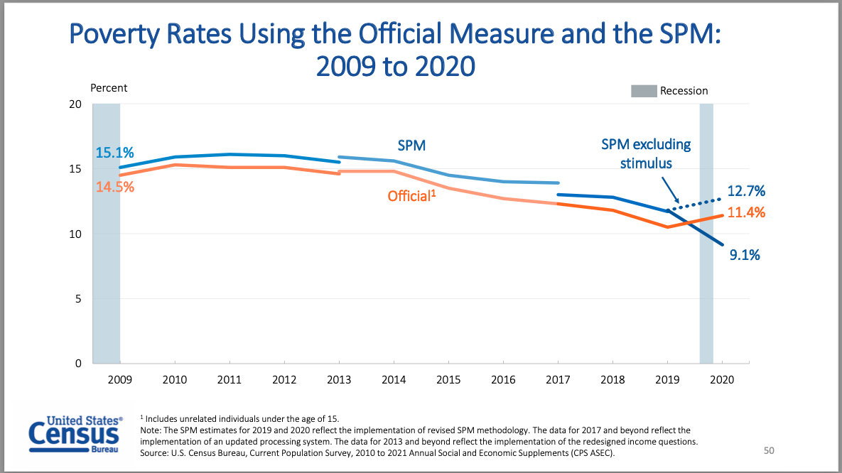
During a global pandemic and economic crisis — the number of children living in poverty actually went down.
How can that be?
To put it simply, Congress stepped up and invested in things that help children. This included two rounds of stimulus payments and an increase in emergency unemployment benefits and food assistance that helped keep kids housed, fed, safe, and healthy when the world around them was chaotic.
If we hadn’t done this — the results would have been disastrous. The dotted line in the chart shows us this. With this benefit, 3.3 million fewer children were living below the poverty line in 2020.
Poverty — particularly child poverty — is complicated. The latest census report is nearly 100 pages and that doesn’t even include all of their data. Child poverty is not something that we can snap our fingers and eradicate tomorrow — but the good news is, and the chart shows this — we know what works to put us on that path. Two years ago, a landmark study from the National Academy of Sciences gave us the playbook — and Congress has started to come around to this reality. First, during a moment of crisis lawmakers passed stimulus payments and invested in programs like the Child Tax Credit — and, now that we have data that proves their outsized impact, Congress has an opportunity to make these common-sense expansions permanent.
Imagine what this chart could look like after a full year of monthly expanded child tax credit payments like we’ll have in 2021 — an investment that Congress made this year and that is not included in this chart. That investment has the potential of cutting child poverty in half — but is only authorized through the end of this year.
Imagine if that didn’t expire. Imagine if we kept investing in kids the way we have recently.
Imagine if we could simply wipe away that dotted line.
Congress has that opportunity right now, all they have to do is follow the numbers and one simple chart.